
Creating your own Interactive Smart Home Floor Plan: Part 5

We've created our images. We've set up our smart devices, sensors and integrations. Everything is ready to be pulled together into one, cohesive dashboard.
It's worth noting at this time that I don't know how you've named, labelled, or otherwise stored your images and devices. What I aim to do here is show you how to bring things together in a way which lets you modify things to suit a) your own HA ecosystem and b) make any aesthetic changes you want.
What you need to continue
- Your images in the
/config/wwwfolder as per part 4's instructions - Your integrations set up and working
- Time and patience for the bunch of code you're going to have to copy and/or write
Creating Your Dashboard
- Head over to
Settings>Dashboards

- Click
+ADD DASHBOARDin the bottom right corner, thenNew dashboard from scratchin the popup modal - Give it a name, assign an icon if you want, change the path, choose whether this should be admin-only or not and if you want it to be shown in the sidebar. Click
CREATE

- Open it using the
OPENbutton

- Select the pencil
Edit dashboardbutton top right, then the same icon on the top left next toHOME, then fill out the configuration - You MUST change the
View typetoPanel (1 card) - Click
SAVEwhen you're ready

- Click the
+ ADD CARDbutton bottom right
And that's the (empty) dashboard created. I have a default theme selected in settings which is why mine looks like that, yours may just be the default dark or light theme.
Creating our Initial Dashboard Image
Now we get into it.
- Click the
+ ADD CARDbutton bottom right - We're looking for the
Picture elementscard

- When it first populates, this below is what you'll see. We're going to work with the area inside the red rectangle

- Copy and paste the following into the yaml editor.
localat the beginning of the various.pngfilenames tells HA to look in your/config/wwwdirectory for the folders and files referenced in the rest of the string:
type: picture-elements
elements:
  - entity: sensor.time_of_day
    type: image
    state_image:
      Afternoon: local/floorplan/home_afternoon_lights off.png
      Morning: local/floorplan/home_morning_lights off.png
      Evening: local/floorplan/home_evening_lights off.png
      Night: local/floorplan/home_night_lights off.png
    style:
      top: 50%
      left: 50%
      width: 100%
image: local/floorplan/home_transparent.png elements and above image in the first columnThis creates our first image and provided your file paths are correct should immediately show you the right image for the time of day where you are. Currently, it's my afternoon:

So what are we doing here?
- We're setting the image to be based on the time of day
- It references the
time of daysensor we created in Part 4 - It sets an image for each time of the day
- It centers the image
- It references the
- We're creating a template everything else will build on, and if you click
SAVE...

EDIT bottom left of the screenAdding Your Entities
So this is all well and good, but what we want to be able to do is to control things and have the image react, right? Let's add our light.
light. and should have the name you gave it. For the purposes of this walkthrough, I'm going to be using light.living_room_1- Copy the following, changing the light entity to match your own:
  - type: state-icon
    entity: light.living_room_1
    tap_action:
      action: toggle
    style:
      left: 50%
      top: 50%
      opacity: 100%
      scale: 1.3
      '--mdc-icon-size': 15px
      '--paper-item-icon-color': red
'--paper-item-icon-active-color': orange - Paste it into the editor in the same place as shown below:

What have we done here?
- We've added an entity called
state-iconand pointed it at our light entity - We've told it that when we tap the icon, it should toggle the state
- HA knows this is a binary switch (i.e. it's either 'on' or 'off') so this works well for us
- We've told HA where to show this icon in the image, how opaque/transparent we want it, how big we want it, and what color it should be based on whether it's active ('on') or not ('off')
On the right, you can see our image now shows a solid red light icon. HA is clever enough to know if you're using a single light or multiple lights in an entity, and will auto populate that for you. If you click the icon, it will turn on your physical light, and the icon will change color to 'orange' (which on my screen is a better color than yellow).
Modifying the way your entities look
Maybe we want to change the icon though? Simply add in an 'icon' line and you can assign any icon from the mdi list:

If you want to set a custom icon instead, you can do so in the same way we pull in images, with local/path/to/your/icon.
The style block allows us to change the position of the icon as well. The higher the percentage, the further from that side the icon will be, so left: 90% is almost all the way to the right, and top: 10% is almost all the way at the top of the image.
- Play with this and click save after every change to get the icon where you want it on the image
SAVE may be different. This is because we're working with screen width percent, not pixels. In the same way, expect that the icon will change position when comparing it with screens of different resolutions. This is important to remember if you're planning on using this on a tablet, mobile or desktop.My yaml and image now look like this:
  - type: state-icon
    entity: light.living_room_1
    icon: mdi:lamp
    tap_action:
      action: toggle
    style:
      left: 47%
      top: 57%
      opacity: 100%
      scale: 1.3
      '--mdc-icon-size': 15px
      '--paper-item-icon-color': red
      '--paper-item-icon-active-color': orange
I've included opacity here as well. Some people may prefer to have a completely transparent icon so that it feels like you're clicking the lamp in your base image, rather than the icon. I prefer not showing the icon as it doesn't look as good.
- Change the yaml to
opacity: 0%to make the icon invisible
Making the image react to the light entity state
So we can now turn our light on or off by tapping the icon (or where the icon is) on our image. To have the image react, we need to add another block to the code above the state-icon block which says 'hey HA, when this entity does X, I want the image to do Y:
  - type: image
    entity: light.living_room_1
    tap_action:
      action: none
    hold_action:
      action: none
    style:
      left: 50%
      top: 50%
      width: 100%
    state_image:
      'on': local/floorplan/guide/home_evening_livingroom table light on.png
      'off': local/floorplan/guide/home_transparent.png
If I then press SAVE I have two different images based on the image state (I've changed the state to evening and left the icon opaque below so the changes are more obvious):


0%Our full yaml right now looks like this:
type: picture-elements
elements:
  - entity: sensor.time_of_day
    type: image
    state_image:
      Afternoon: local/floorplan/guide/home_afternoon_lights off.png
      Morning: local/floorplan/guide/home_morning_lights off.png
      Evening: local/floorplan/guide/home_evening_lights off.png
      Night: local/floorplan/guide/home_night_lights off.png
    style:
      top: 50%
      left: 50%
      width: 100%
  - type: image
    entity: light.living_room_1
    tap_action:
      action: none
    hold_action:
      action: none
    style:
      left: 50%
      top: 50%
      width: 100%
    state_image:
      'on': local/floorplan/guide/home_evening_livingroom table light on.png
      'off': local/floorplan/guide/home_transparent.png
  - type: state-icon
    entity: light.living_room_1
    icon: mdi:lamp
    tap_action:
      action: toggle
    style:
      left: 47%
      top: 57%
      opacity: 0%
      scale: 1.3
      '--mdc-icon-size': 15px
      '--paper-item-icon-color': red
      '--paper-item-icon-active-color': orange
image: local/floorplan/guide/home_transparent.png
- type: image must be above the - type: state-icon it relies on otherwise you won't be able to click/tap your iconCongratulations!
You've now created your first smart home floorplan. You can go through and continue adding your light entities with their associated images which will modify the way the floorplan looks depending on their state.
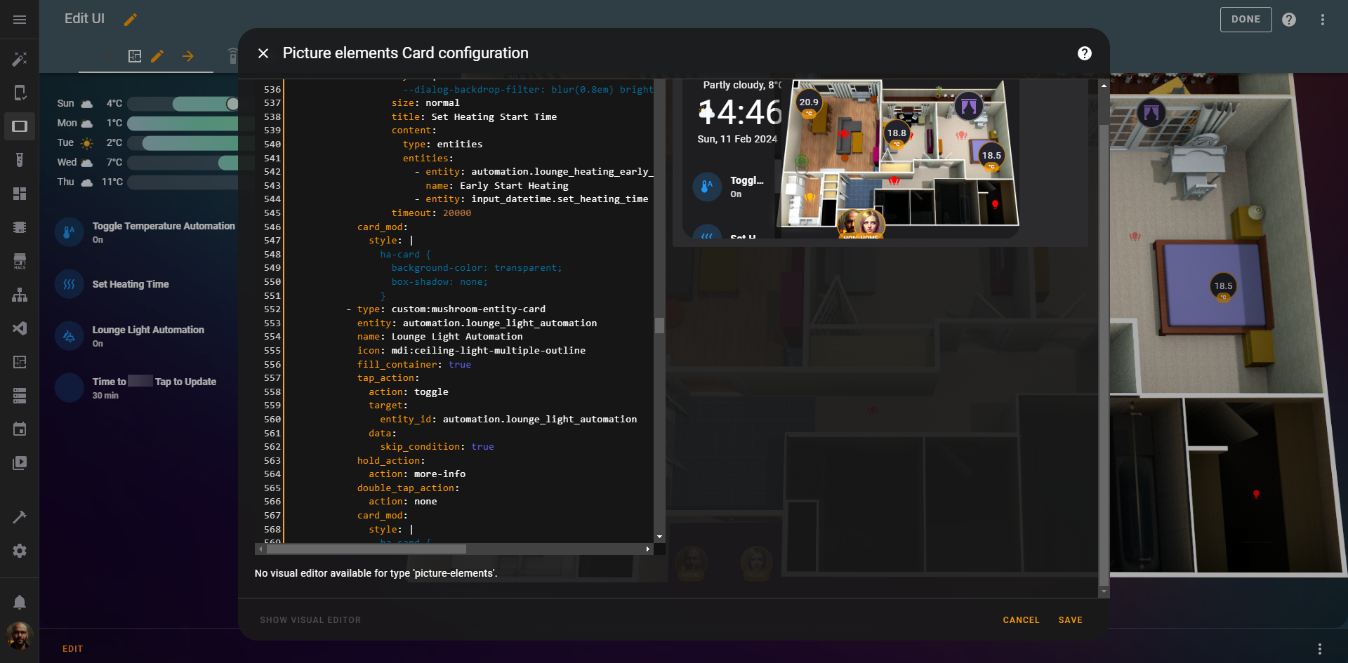
And it doesn't stop there. You can add 'if' statements to these to change the way the 'on' or 'off' states affect the image depending on time of day. You can add your TVs, your automatic curtains, your robot vacuums, temperature sensors... there's so much more. My current tablet view looks like this:
This has various popups and toggles, making use of various mods you can use in HACS, such as the card mod, browser mod and mushroom card add-ons. By clicking Set Heating Time for instance a little modal pops up and lets me choose the time in the morning I want my heating to come on and a toggle to enable that particular automation:


The code for that looks like this, and is based on a lot more back-end work such as adding the add-ons in HACS, and creating the relevant automations:
          - type: custom:mushroom-entity-card
            entity: input_button.set_heating_timer
            secondary_info: none
            name: Set Heating Time
            icon: mdi:heat-wave
            tap_action:
              action: fire-dom-event
              browser_mod:
                service: browser_mod.popup
                data:
                  browser_id: THIS
                  style: |
                    --dialog-backdrop-filter: blur(0.8em) brightness(1.2);
                  size: normal
                  title: Set Heating Start Time
                  content:
                    type: entities
                    entities:
                      - entity: automation.lounge_heating_early_start
                        name: Early Start Heating
                      - entity: input_datetime.set_heating_time
                  timeout: 20000
            card_mod:
              style: |
                ha-card {
                  background-color: transparent;
                  box-shadow: none;
                }
All told, my yaml has 1003 lines to achieve the look and functionality I want. You may not need as much, or you may need more. The beauty of it is, you can do what suits you!
Final thoughts
This has been a journey. Apologies to those who waited a while for this latest and final installment of the guide to be published, I hope this has helped in some way.
There are a lot of moving parts to this. Things will break, things won't work as you initially expect, and sometimes you'll take 3 days to figure out how to achieve that tiny change you wanted. IMHO it's worth it though, and hopefully you'll think so too.
If you have further questions or comments or thoughts on this, you can find me on discord with this link.
Related Links
 PTS
PTS PTS
PTS